When venturing into the world of printing, one acronym that consistently appears is CMYK. This model is not just a random set of letters but a cornerstone of color printing technology that ensures every shade and hue on your print material looks exactly as intended. Understanding CMYK is crucial for anyone involved in digital design or printing because it directly affects the outcome of printed products. But what exactly does CMYK stand for and why is it so pivotal in the printing process? This article will delve into the essentials of CMYK, providing a clear understanding of each component and its significance in creating vibrant and precise print outputs.

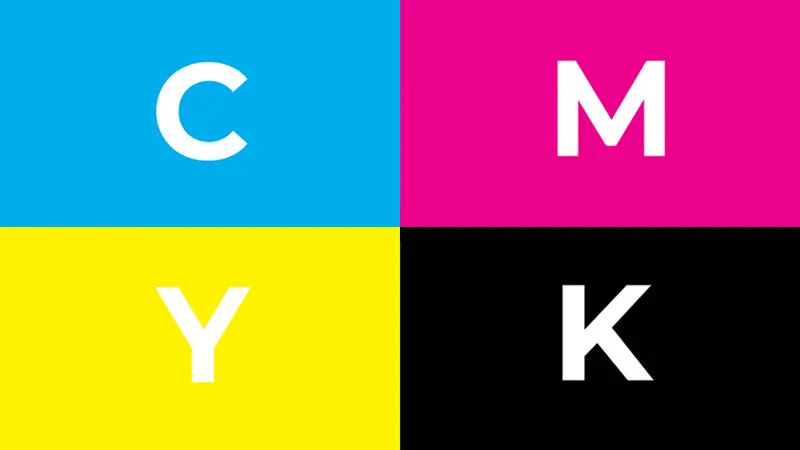
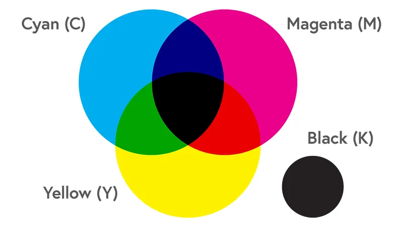
The term CMYK stands for Cyan, Magenta, Yellow, and Key. In this context, “Key” usually refers to black ink, which is pivotal in the printing process. These four colors form the foundation of the subtractive color model used in color printing. While Cyan, Magenta, and Yellow might be more straightforward in understanding, the ‘Key’ often puzzles many. The reason black is referred to as ‘Key’ is because it is the main color used in the alignment of the other three colors. It provides the necessary depth and detail to images, serving as the ‘key’ to achieving the desired visual impact.
In the world of printing, these colors are applied in layers to a white canvas, such as paper, with each layer subtracting light to create a spectrum of colors. The CMYK model is a fundamental concept in print design and is essential for anyone looking to produce accurate, consistent prints. Whether you’re designing a business card or a large poster, understanding how these four colors interact can make a significant difference in the final product’s appearance.
Each color in the CMYK model plays a critical role in achieving the full spectrum of colors that we see in printed materials. Here’s how each contributes:
● Cyan: A greenish-blue color that forms one of the primary colors in the CMYK color model. It serves as the base for cooler colors and helps in creating shades of green when mixed with yellow.
● Magenta: A deep, purplish-red that is another primary color in the model. It’s crucial for producing vibrant purples and pinks when mixed with cyan and for adding depth to reds when combined with yellow.
● Yellow: The third primary color in the model, yellow is essential for creating bright and warm hues. When overlaid with cyan, it produces greens, and with magenta, it creates oranges and reds.
● Key (Black): Often simply called ‘black,’ Key is used to enhance the depth and detail of the printed image. Without black, images might appear washed out as the other three colors cannot produce deep, dark shades on their own.
Understanding the interaction of these colors is key to mastering print design. By adjusting the intensity and overlap of these inks, designers can manipulate a vast range of colors and tones, ensuring that the printed piece accurately reflects the original design intent.

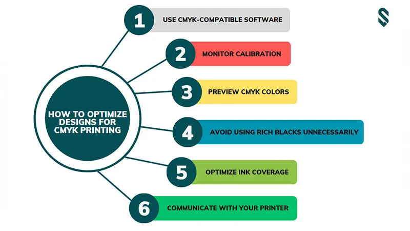
Preparing your artwork for printing in the CMYK color model requires specific attention to ensure the final prints match your vision. Here are practical steps to optimize your designs:
Start your design in a software program that supports CMYK color settings. Programs like Adobe Photoshop, Illustrator, and InDesign allow you to set up your document in CMYK mode from the beginning, which helps avoid color mismatches.
Calibrate your computer monitor to better approximate how colors will look when printed. This adjustment helps bridge the gap between digital designs on an RGB screen and their appearance in CMYK print.
Regularly toggle the preview mode to see how your RGB colors translate into CMYK. This step can help you make necessary adjustments early and avoid surprises in the final print.
Rich black, created by mixing heavy amounts of all CMYK inks, provides depth in large areas of black. However, it can cause issues like smudging or overly dark tones if not used judiciously. Use it sparingly and only where needed.
Too much ink on paper can lead to printing problems. Keep the total percentage of all ink colors (Total Ink Coverage) under 300% to ensure the best print quality and avoid issues like ink bleeding.
Before finalizing the design, discuss it with your printing service to understand their specific requirements and limitations. This communication can include details about ink limits, paper type, and preferred file formats.
By following these guidelines, you can fine-tune your designs for the CMYK printing process, ensuring that the printed materials accurately reflect your artistic intentions.

In printing, using CMYK is crucial because it aligns with the ink used on most commercial and home printers. RGB, designed for digital screens, uses light to mix colors which can’t be replicated with ink on paper. Converting from RGB to CMYK ensures that the colors you design are the ones you see in print, avoiding discrepancies and achieving color fidelity.
To minimize color loss during conversion from RGB to CMYK, use professional design software like Adobe Photoshop, which allows for more precise control over the conversion process. It’s also beneficial to manually adjust the color levels after conversion to ensure they closely match the original hues as much as possible.
CMYK has a more limited color gamut compared to RGB, which means it cannot reproduce the vibrancy and brightness of RGB colors perfectly. This limitation is due to the subtractive nature of the CMYK process, where mixing inks reduces light reflection off the paper, diminishing brightness.
When aiming for high-detail prints, it is important to manage color saturation carefully. Avoid using very dark colors composed of high levels of all CMYK inks, as they can lead to muddy or overly saturated prints. Focus on clarity by choosing lighter color mixes and ensuring that text sizes are optimized for the level of detail required. Always provide a proof to your printer and ask for a sample print to verify the detail and color accuracy.
Paper quality significantly influences the final appearance of your CMYK prints. High-quality paper can handle a greater density of ink without bleeding, which sharpens and enhances color saturation. Choose a paper type that complements your project; for vibrant photo prints, glossy paper is ideal, while matte paper works best for more text-heavy designs.
At Syloon, we pride ourselves on using the best equipment, including Heidelberg printing presses, renowned for their precision and efficiency. These presses allow us to offer superior color accuracy, consistency, and quality across all print jobs. Whether you’re printing intricate graphic designs or large-scale marketing materials, our Heidelberg presses ensure that every detail is sharp and every color pops exactly as intended. Let Syloon help you achieve professional results that make your brand stand out.